Creating a User Interface
🎮 GDC: Park Clean-Up Game
In this project, we will continue developing Park Clean-Up, the casual puzzle/exploration game we previously introduced. Players take on the challenge of restoring a park by collecting and disposing of trash in designated bins.
UI Sprites
In our previous chapter on UX Design, we covered creating wireframe mockups of UI elements. Once the wireframe has been approved by the game production team, any of the images, such as icons, textures and or backgrounds are developed, using external tools, such as illustrator.
🛠 UI Sprite Setup
Tutorial: UI Sprite Setup
📝UI ToolKit | 🕒15 minutes | 📂Required File: Park Clean-Up Game
In this tutorial we prepare png files to be used as 2d sprites for UI.
Before we start, make sure your image is saved as a PNG file. Unity can import various image formats, but PNG is a common choice for 2D assets due to its transparency support and lossless compression. Once the files are saved, you’ll need to import them into your Unity project.
Step 1: Save and Import PNG Files
- Ensure your UI graphics are saved as PNG files.
- In Unity, navigate to the Assets folder in the Project window.
- Create a new folder by right-clicking in the Project window and selecting
Create > Folder. Name it Sprites. - Drag and drop your PNG files into the Assets > Sprites folder.
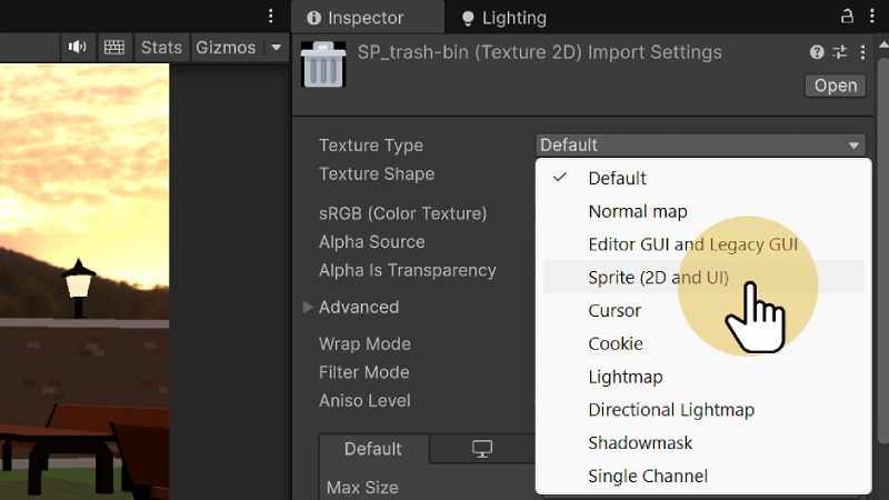
Step 2: Set the Texture Type to Sprite
Before the image can be used as a UI element it has to be defined as such in the Inspector.
- In the Project window, select the imported image inside the Sprites folder.
- In the Inspector window, scroll down to the Texture Type dropdown.
- Change Texture Type to
Sprite (2D and UI).
The Texture Type setting tells Unity to treat the image as a sprite, which is necessary for using it in a 2D environment or UI elements. This ensures Unity applies the correct optimizations for 2D rendering and that it can be used in 2D scenes or UI elements.
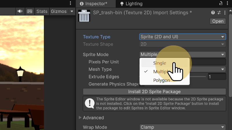
Step 3: Adjust Sprite Mode
Often, for optimization and animation purposes, sprites are imported as a single sprite sheet, which contains multiple individual sprites or frames of animation. As a result, the Sprite Mode is typically set to Multiple by default. However, since we are using a single sprite image rather than a sprite sheet, we need to change the Sprite Mode to Single. This ensures Unity treats the image as one individual sprite, rather than attempting to slice it into multiple sprites.
- In the Inspector window, scroll down to Sprite Mode.
- Change Sprite Mode to
Single(if it isn’t already).
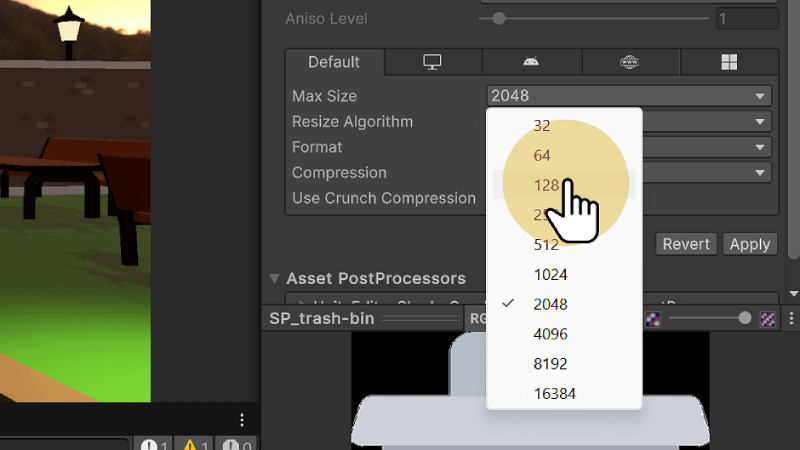
Step 4: Set Max Size
The Max Size setting is used to control the maximum dimensions of the image in memory. This is useful for optimizing performance, particularly for UI elements or smaller sprites that don't need a high resolution. It is best practice to always set your images Max Size to the maximum size they will ever appear on screen.
- In the Inspector window, scroll down to Advanced Settings.
- Set Max Size to
128.
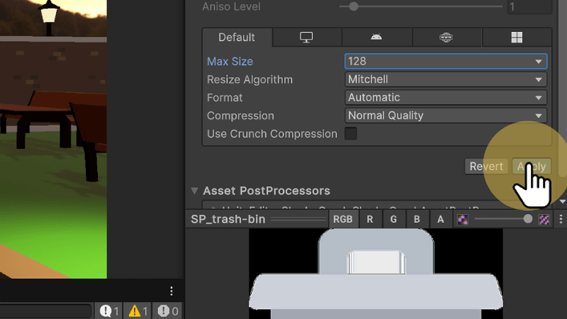
Step 5: Apply Changes
- Scroll down to the bottom of the Inspector window.
- Click the Apply button.
Clicking Apply commits all the changes you've made in the Inspector to the texture. Without this step, Unity won’t update the settings, and your image won’t be configured correctly. This ensures the image is now set up as a 2D sprite and ready to use in your project.
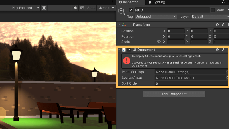
UI Document
To get started creating our user interface we begin by creating a UI Document. The UI Document acts as the primary container for UI elements in Unity's UI Toolkit.
🛠 Create a UI Doc
Tutorial: UI Document
📝UI ToolKit | 🕒15 minutes | 📂Required File: Park Clean-Up Game
In this tutorial we create a UI Document for our HUD.
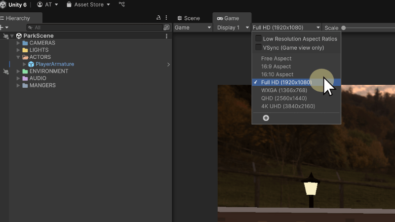
Step 1: Open the Park Scene
- Open the ParkScene in Unity.
- Click on the Game View tab to preview the scene.
- Set the resolution to Full HD 1920 x 1080.
Step 2: Create the UI Document
- In the Project window, navigate to the
Assets > UIfolder. - Right-click in the UI folder and select
Create > UI Toolkit > UI Document. - Name the document UI-HUD.
This document will serve as the root container for our HUD elements.

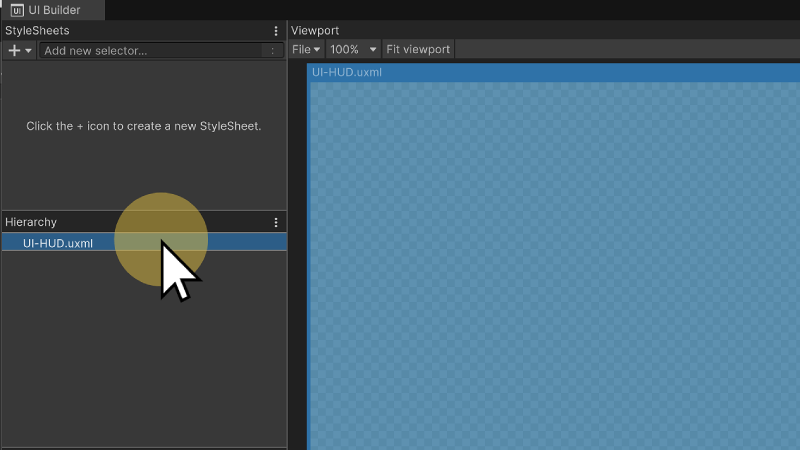
Step 3: Edit the UI Document
- In the Project window, locate and double-click on UI-HUD.
- This will open the Unity UI Builder.
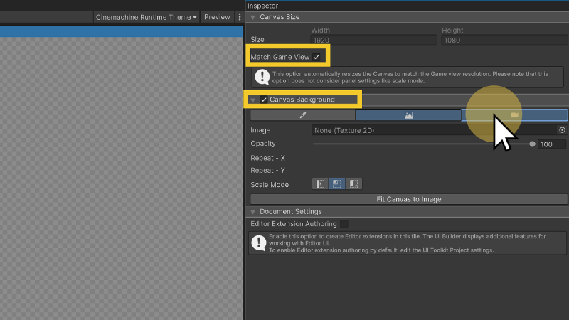
Step 4: Configure the Canvas Settings
To ensure our UI scales properly and aligns with the game view, we need to configure the Canvas Settings in the UI Builder. By enabling Match Game View, the UI dynamically adjusts to fit the resolution set in the Game View, ensuring elements scale correctly across different screen sizes.
- In the UI Builder, select UI-HUD.uxml in the Hierarchy panel.
- In the Inspector, under Canvas Size, check
Match Game View. - Enable the Canvas Background option.
- Under Canvas Background settings, select the Camera tab.
- Assign the Main Camera as the canvas background.
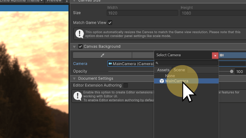
Setting the Main Camera as the canvas background allows UI elements to be positioned relative to the in-game view, making it easier to design HUD elements that align with the player's perspective. This is particularly useful for overlay elements like health bars, mini-maps, and notifications.
🛠 Applying Global Styles
Tutorial: UI Global Styles
📝UI ToolKit | 🕒15 minutes | 📂Required File: Park Clean-Up Game
In this tutorial we will import the Global UI Styles.
To maintain consistency across UI elements, we will apply a global stylesheet to the UI document. This global stylesheet will provide default styling rules for our UI components.
Step 1: Add a Global Stylesheet
- In the UI Builder, navigate to the StyleSheets panel.
- Click the Plus icon and select
Add Existing USS. - Navigate to
Assets > UI > General > USS-Styles. - Select UI-GlobalStyles.uss.
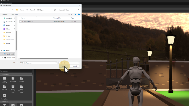
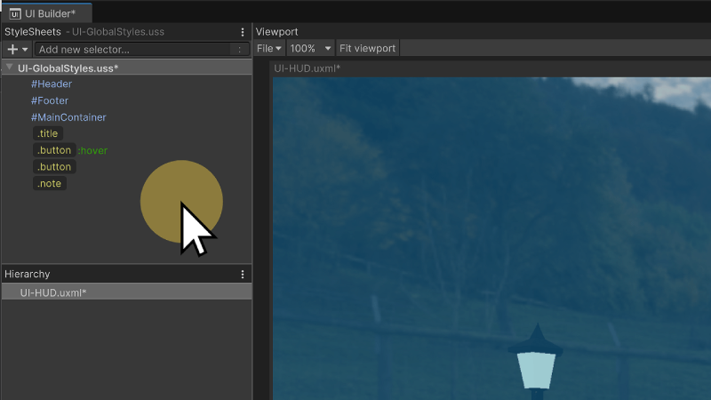
After importing the UI-GlobalStyles.uss file, the styles (IDs and classes) will appear in the StyleSheets window.
Heads-Up Display
The HUD (Heads-Up Display) in a game acts as the primary user interface that provides players with essential information without disrupting gameplay. Positioned as an overlay on the screen, the HUD ensures that players can quickly access critical data without needing to navigate through menus. In this section, we will create a HUD UI in Unity UI Toolkit, following the wireframe example discussed in the UX Design chapter. This ensures that our HUD follows a structured design process and maintains consistency with the game's visual and usability guidelines.
🛠 Creating the HUD Layout
Tutorial: UI HUD
📝UI ToolKit | 🕒15 minutes | 📂Required File: Park Clean-Up Game
In this tutorial we create a UI Document for our HUD.
Continuing off from the previous tutorial, make sure that the ParkScene is open and that the UI-HUD document is open in the UI Builder window.
Step 1: Create the HUD Container
- In the Library panel, select Visual Element.
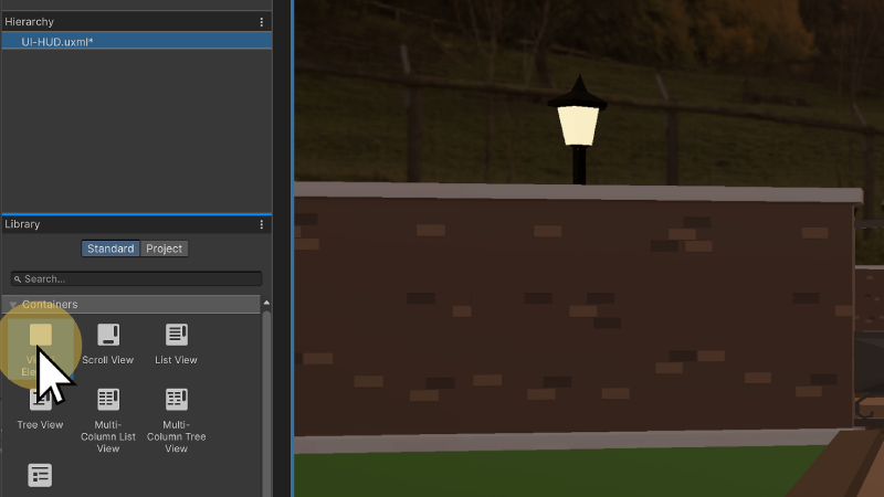
- Drag the Visual Element into the Hierarchy.
- In the Inspector, rename it to HUD.
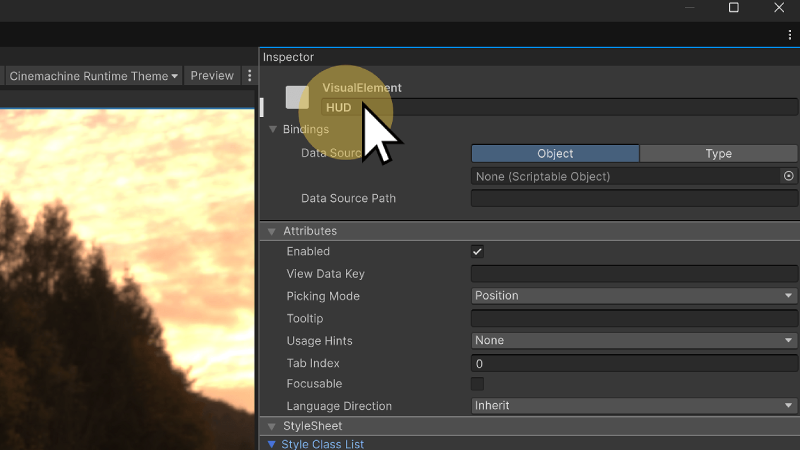
The HUD acts as our full-body container taking up the entire screen, as such it will not require any specific styling. Instead it will automatically take up 100% width and height of the screen.
Step 2: Add the Top Panel
Taking a look at our wireframe layout for the HUD, we have a top panel will hold the information visible throughout the level.
- Inside the HUD element, create a new Visual Element.
- In the Inspector, rename it TopPanel.
Step 3: Apply Styles to the Top Panel
-
In the StyleSheets panel, locate the Add New Selector box.
-
Type
#TopPanelto create a new ID style for the element.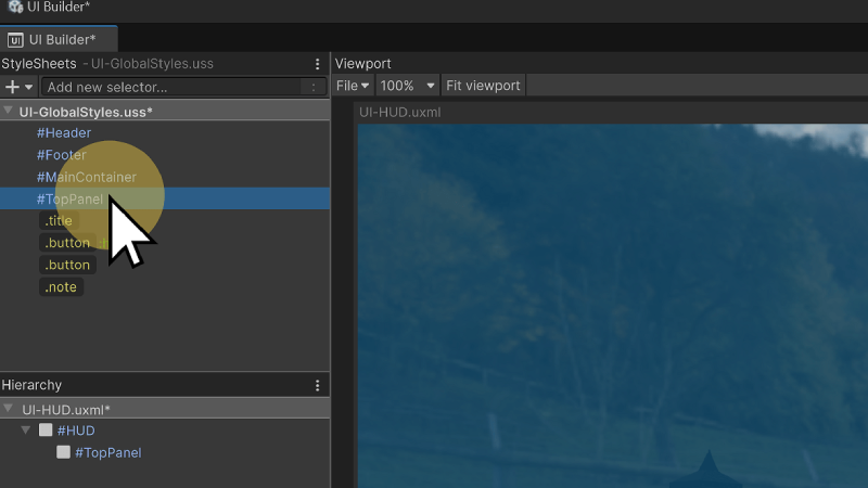
- In the StyleSheets panel, locate the Add New Selector box.
- Type
#TopPanelto create a new style selector. - In the Inspector, apply the following settings:
- flex-direction:
row - min-width:
100% - max-height:
30% - min-height:
15% - padding-top:
20px - padding-right:
20px - padding-bottom:
20px- padding-left:20px
- flex-direction:
In the Hierarchy window select the TopPanel, notice that in the inspector window the settings are automatically applied. In the Style Class List you will also see under Matching Selectors that #TopPanel is applied to this element.
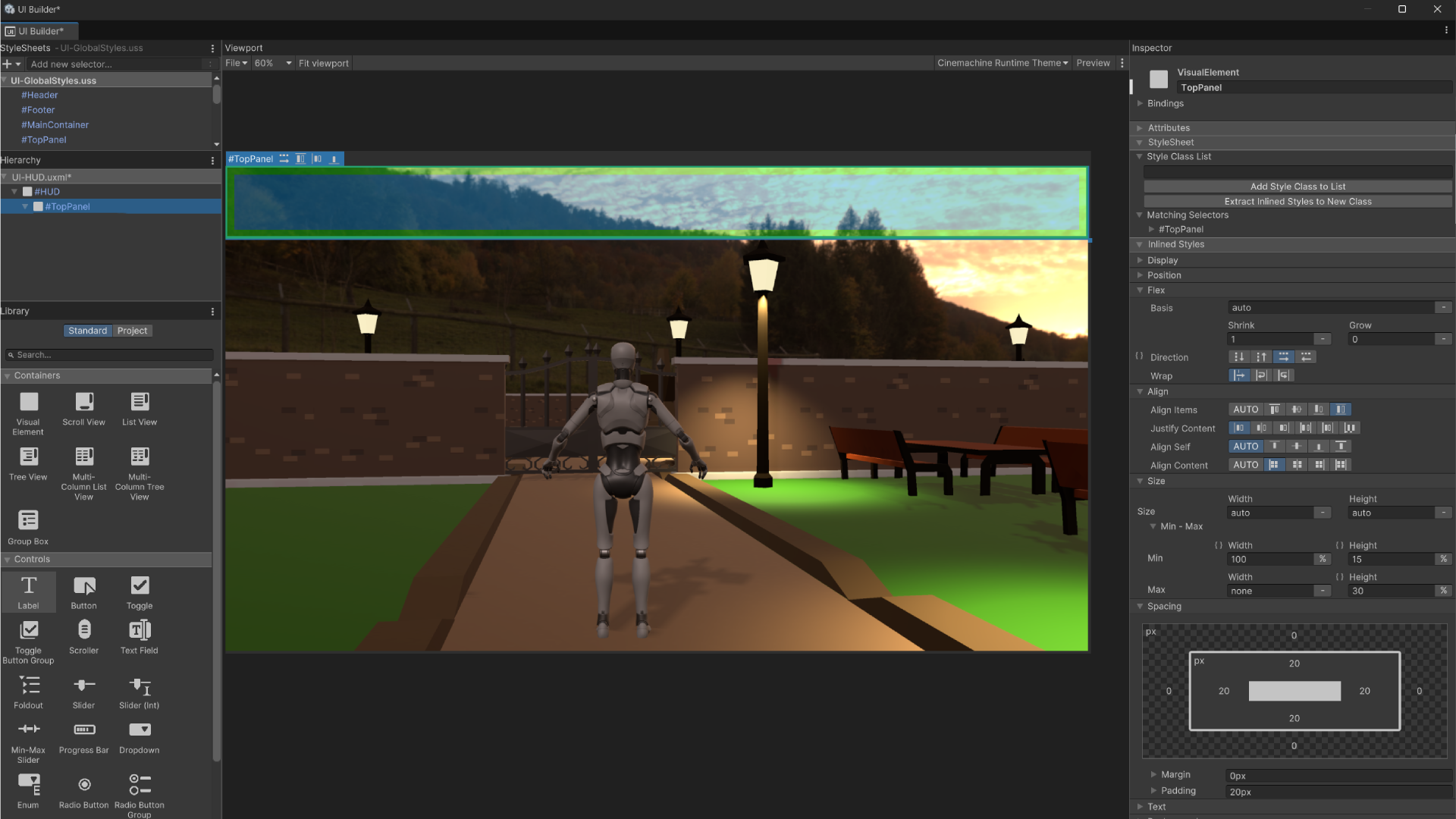
With the TopPanel selected in the Hierarchy you will also see a preview of box element in the preview, including the width, height, padding and margin.
Remember that ID Selectors styles are automatically applied to all elements with the same ID name.
🛠 Adding Containers
Tutorial: UI HUD
📝UI ToolKit | 🕒15 minutes | 📂Required File: Park Clean-Up Game
In this tutorial we create a UI Document for our HUD.
To organize our UI elements efficiently, we will first create a visual container that groups related UI components. This container will hold the collection icon and counter, ensuring they remain visually structured and aligned. While this container doesn’t need a custom class, we will manually define its layout properties since it only needs to function as a row-based container, occupying 25% of the width of its parent.
Step 1: Adding Containers
- In the UI Builder, navigate to the Hierarchy panel.
- Select the HUD element (our main UI container).
- Click the Library panel, then locate and drag a Visual Element into the HUD container.
- With the new Visual Element selected, go to the Inspector and rename it to
Container. - Set the following properties in the Inspector:
- Flex Direction:
Row(Ensures elements inside it align horizontally). - Width:
25%(Relative to its parent, keeping it scalable).
- Flex Direction:
By structuring our UI in this way, we maintain a clean hierarchy while allowing flexibility for future adjustments.
Step 2: Create the Icon Element
Now that we have a structured container, we will add a collection icon inside it. Since this element will be reusable across different UI documents, we will separate its default styling (size and positioning) from its specific appearance (the actual image it uses).
- Inside the Container, add a new Visual Element.
- Rename this element to
Icon. - In the StyleSheets panel, create a new ID selector named
#Icon. - Apply the following settings in the Inspector (these will define the default size and positioning of any icon using this ID):
- display:
flex - flex-grow:
1 - flex-direction:
column - align-self:
center - align-items:
center - min-width:
10% - max-width:
20% - max-height:
100% - min-height:
80%
- display:
At this point, the #Icon selector defines the base appearance of any icon used in the UI.
Step 3: Custom Image with a Class
Since this icon needs to display a specific image (SP_trash-bin.png from our Sprites folder), we will apply a class selector for its background. This keeps the #Icon ID reusable while allowing unique styling through classes.
- In the StyleSheets panel, create a new class selector called
.collectedIcon. - With
.collectedIconselected, apply the following settings in the Inspector:- Background Image:
SP_trash-bin.png(Select this from Assets > Sprites).
- Background Image:
- Drag the
.collectedIconclass from the StyleSheets panel onto the Icon element in the Hierarchy.
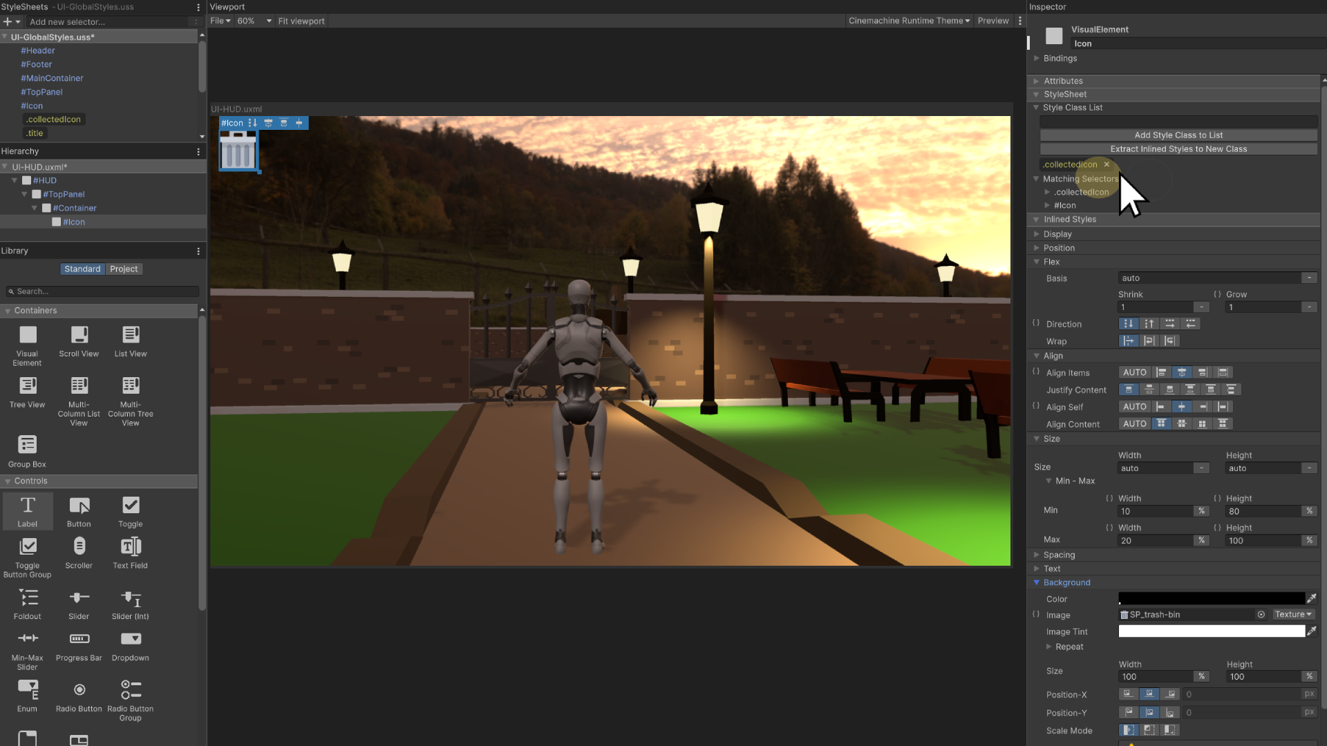
Now, the Icon element has both the base styling from #Icon and the custom appearance from .collectedIcon, making it adaptable and reusable in future UI elements.
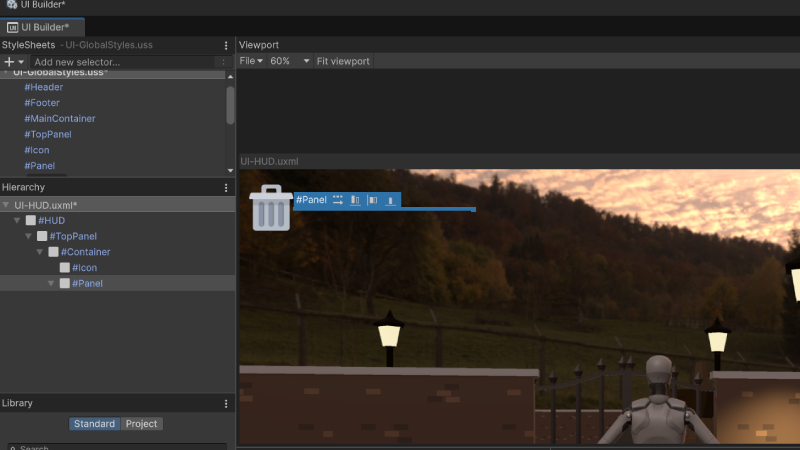
Step 4: Adding the Panel Background
To ensure the counter text has a clean, visually appealing background next to the icon, we’ll add a panel background.
- Inside the Container (below the
Iconelement), drag and drop a Visual Element to create the Panel. - Rename this new element to
Panel. - In the StyleSheets panel, create a new ID selector named
#Panel. - Apply the following styles to
#Panelin the Inspector:- display:
flex - flex-grow:
1 - flex-direction:
row - align-items:
auto - align-content:
auto - min-width:
auto - max-width:
none - max-height:
none - min-height:
auto - background-color:
rgba(255, 255, 255, 0.59)(Semi-transparent white)
- display:
Because we have not set any minimum width and height and because there is nothing inside the panel it appears in the Preview window as only a thin like when selected from the hierarchy.
Step 5: Styling the Panel with a Class
Now that we have our panel, we need some specific adjustments to make it look better and align with our design.
- In the StyleSheets panel, create a new class selector named
.collectedPanel. - Apply the following styles to
.collectedPanelin the Inspector:- justify-content:
flex-start - align-content:
center - align-self:
auto - align-items:
auto - height:
50% - max-height:
100% - min-height:
50% - margin-top:
30px - margin-left:
-10px(This moves the element closer to the icon, creating a slight overlap) - padding-left:
50px - padding-right:
5px - border-top-left-radius:
0 - border-top-right-radius:
40px - border-bottom-right-radius:
40px - border-bottom-left-radius:
0
- justify-content:
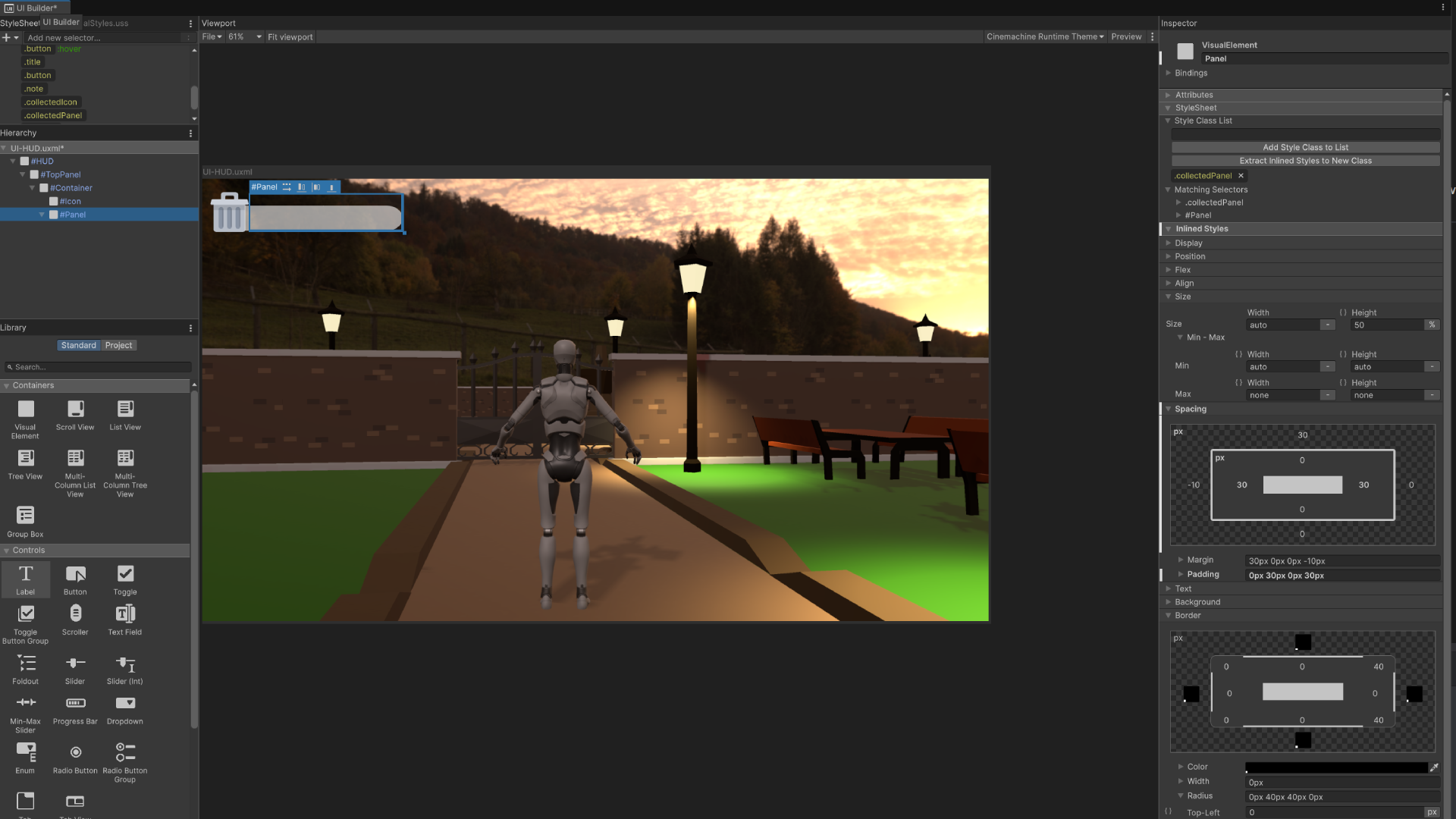
The negative margin-left value creates a subtle overlap with the icon, while the border-radius adds rounded corners for styling.
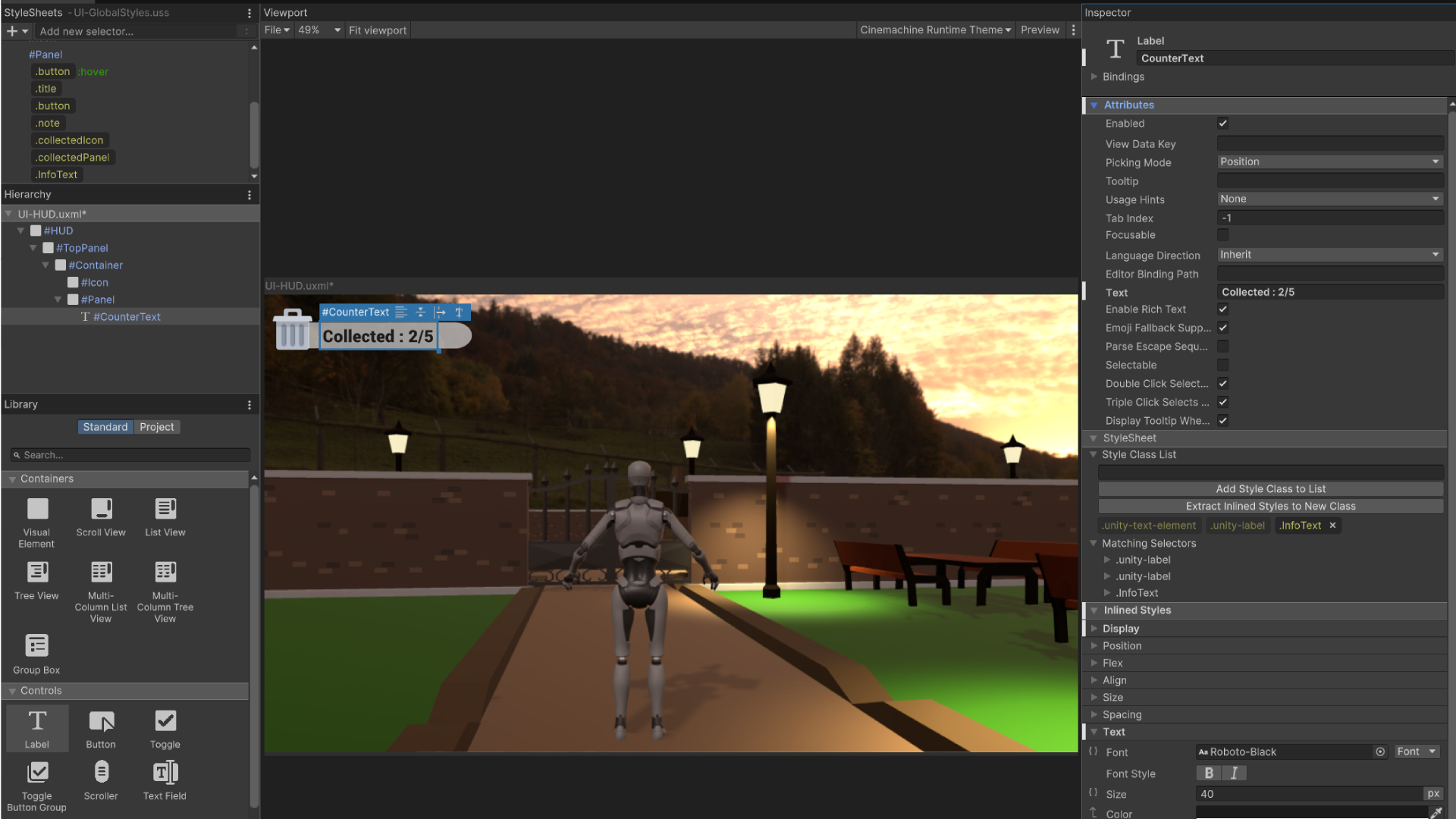
Step 6: Creating the Collected Text
Next, we’ll add the collected item count text inside the panel. Since this text style may be reused, we’ll create a class for general info text styling.
- From the Controls window, drag and drop a Text Label element inside the
Panel. - Rename this element to
CounterText. - In the Inspector under 'Attributes' change the 'Text' value to be a placeholder for what the player will see.
- Type Collected: 2/5 as an example
- In the StyleSheets panel, create a new class selector called
.infoText.- Apply the following styles to
.infoTextin the Inspector:- flex-wrap:
wrap - font:
Roboto-Black - font-size:
40px - justify-content:
center
- flex-wrap:
- Apply the following styles to
- Drag and drop the
.infoTextclass onto theCounterTextelement in the Hierarchy. The counter text will now appear with the proper styling.
🛠 Message Boxes
Tutorial: UI HUD
📝UI ToolKit | 🕒15 minutes | 📂Required File: Park Clean-Up Game
In this tutorial we create a message box for providing information to the user
To provide mission objectives or important notifications, we will create a Message Box that appears in the center of the screen. This box will be placed inside the HUD container, ensuring it overlays other UI elements when displayed.
Step 1: Adding a Container for the Message Box
- In the UI Builder, navigate to the Hierarchy panel.
- Select the HUD element.
- From the Library panel, drag and drop a Visual Element inside the HUD but below the
Panel. - Rename this element to
Container. - In the Inspector, set the following properties:
- flex-direction:
Column - width:
100% - height:
100% - justify-content:
center - align-items:
center
- flex-direction:
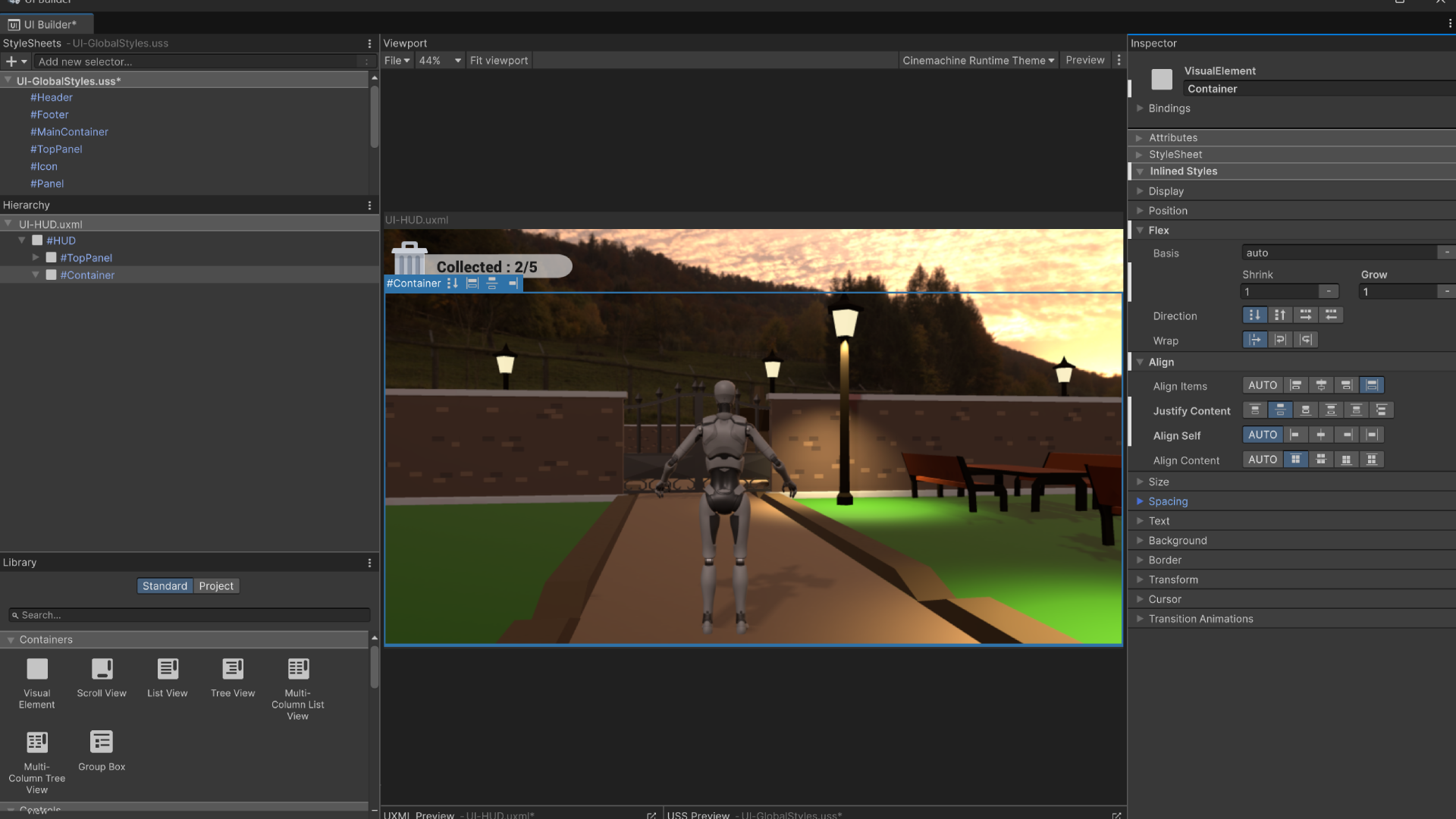
This ensures the Message Box is centered and takes up the entire screen space.
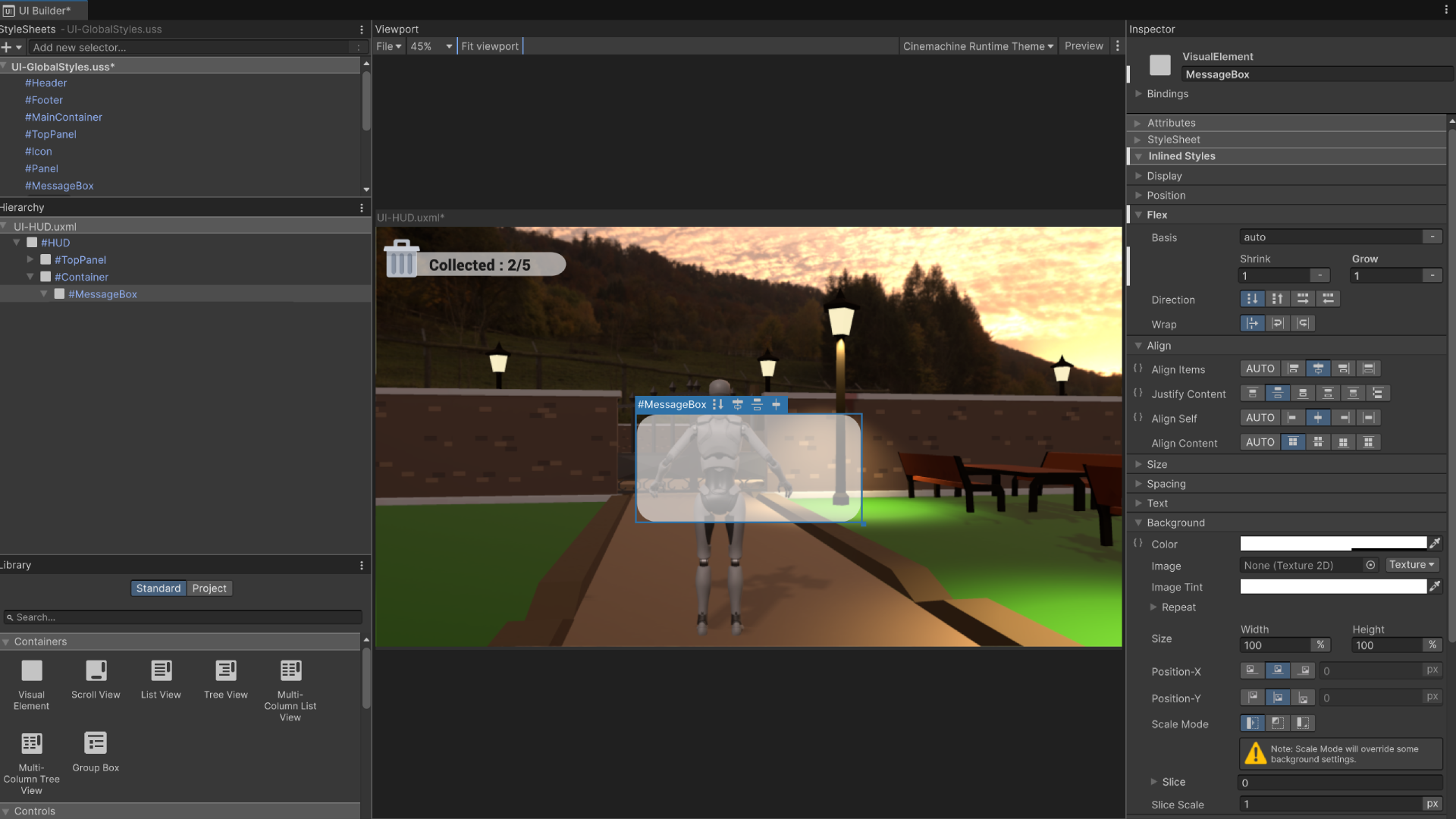
Step 2: Adding the Message Box
- Inside the newly created
Container, add a new Visual Element. - Rename this element to
MessageBox. - In the StyleSheets panel, create a new ID selector named
#MessageBox. - Apply the following styles in the Inspector:
- flex-grow:
1 - justify-content:
center - max-height:
30% - min-height:
20% - max-width:
60% - min-width:
30% - align-items:
center - align-self:
center - background-color:
rgba(255, 255, 255, 0.59) - border-radius:
50px(for rounded corners)
- flex-grow:
This ensures the Message Box appears as a centered overlay with a semi-transparent background.
Step 3: Adding the Message Text
- Inside the MessageBox, add a Text Label element.
- Rename this element to
MessageText. - In the StyleSheets panel, ensure the
.noteclass exists and contains the following settings:- Font:
Roboto-Black - Text Alignment:
Upper-Center - Flex Grow:
0 - Font Size:
25px - Flex Wrap:
Wrap - White-Space:
Normal - Margin:
20px
- Font:
- Apply the
.noteclass to the MessageText element. - In the Attributes panel, write out the objective of the first mission for the game.
Step 4: Adding the Close Button
- Inside the MessageBox, below
MessageText, add a Button element. - Rename this button to
CloseButton. - Apply the
.buttonclass to the CloseButton. - Modify the Attributes panel to set the button text to
Close.
With these steps completed, the Message Box will display mission objectives and include a close button for dismissal. The next step will involve scripting interactions to update and interact with UI elements.
Step 5: Saving Changes
Our UI Document for our HUD is now complete before we close the UI Builder we need to make sure that we save all our changes to the StyleSheet.
- With the UI Builder open press
CTRL + Sto save all our changes - Exit the UI Builder and return to the ParkScene in the Unity Editor.
Integrating the UI
While our UI document for the HUD is complete, it hasn’t yet been added to the game. There are several ways we could integrate the UI into the scene. For instance, we could use scripts to dynamically load it, or we could create a separate scene for the UI and additively load it on top of the main game scene. However, for simplicity, we’ll be adding the UI directly as a game object in the ParkScene.
🛠 Add the UI to the Scene
Tutorial: Add UI
📝UI ToolKit | 🕒15 minutes | 📂Required File: Park Clean-Up Game
In this tutorial we add the UI to the Scene
A UI Document cannot be directly added to the scene like other assets. Instead, it must be attached to a GameObject in the hierarchy. This GameObject acts as the container for the UI, allowing it to be displayed and interact with the rest of the game. In this step, we'll be creating a GameObject to hold the UI Document and setting it up properly.
Step 1: Add the UI Game Object
-
In the ParkScene hierarchy, right-click and create a new folder. Name it UI.
- This folder will help keep your UI elements organized.
-
Inside the UI folder, add an empty GameObject and name it HUD.
- Right-click the UI folder, then select Create Empty and rename it accordingly.
-
Reset the position of the HUD GameObject to (0, 0, 0) in the XYZ axis.
- This step is not strictly necessary, but it helps keep things clean and organized.
Step 2: Add the UI Document Component
- With the HUD GameObject selected, go to the Inspector Window and add a UI Document component.
- Click Add Component and search for “UI Document.”
- In the UI Document component, set the UI Settings
- From the Project window in the
Assets/UI/Generalfolder select the UI-Settings - Drag and drop this file to the UI Settings in the
UI Documentcomponen on the HUD GameObject in the Inspector
- Assign UI-HUD in the UI Document Component
- Drag the UI-HUD document from the Project window into the field.
- Click on the Game window
- The UI will display in the game view once the UI Document component has been properly setup.
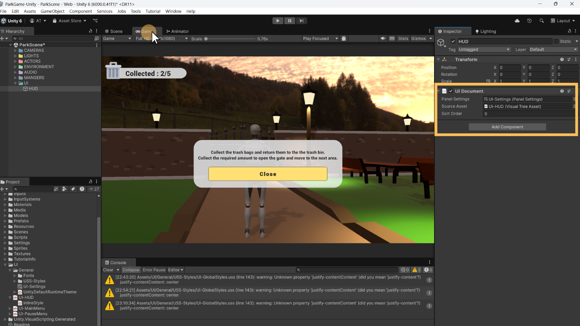
- Playtest the scene
- Click the Play button to test the scene.
- The UI should appear in the game over everything else.
At the moement the UI is static and will just overlay on top of everything, this includes the message box in the center of the scene. In the next section we will create scripts to control the update and visibility of UI elements.
📝 Next Mission
Objective:
Now that you've created the HUD for the Park Clean-Up Game, it's time to expand the UI by creating a Game Over screen. In this mission, you will be setting up the UI Document for the Game Over scene, allowing you to display relevant information when the game finishes. You will:
- Design the Game Over UI layout, consider making a quick wireframe sketch.
- Add the UI elements to display at the end of the game.
- Attach the UI Document to the Game Over scene.
Additionally, you are encouraged to get creative with your UI layout and consider what information would be valuable to display to the player at the end of the game. You can also revisit the UI-HUD document to enhance it with new features like an expanded container for information on other objectives.
Requirements:
-
Import & Set Up UI Package
-
Download the UI Package: Download the
UI-MenuStarter.unitypackageand import it into your project.- Download: [UI-MenuStarter.unitypackage]
-
The package includes:
- Scenes for Main Menu, Pause Menu, Game Over Scene, and Default Scene.
- Scripts for button functions and scene management.
-
-
Importing the Package
- In the Unity Editor, open the Project Window, right-click and choose Import Custom Package. Select the downloaded package.
- Open Build Settings (File → Build Settings) and add the imported scenes, along with your main game level, to the list of scenes in the build.
- Ensure that the Default Scene is set as the first scene in the build index.
-
Create the Game Over UI
-
Game Over Scene UI Design: Open the GameOver scene located in Asses / Scenes / Other in the Project window.
-
Create a New UI Document: Create a new UI Document named UI-GameOver and set up the interface.
- You can include elements such as a "Game Over" title, a score display, and buttons for restarting the game or returning to the main menu.
- Get creative with the layout! Think about what information would be useful to the player after they finish the game. For example, you might include:
- Final score or collected items
- Congratulations message
- A button to restart the game
- A button to exit or return to the main menu
-
-
Implement Game Over UI
- Once you’ve created the UI-GameOver document, go to the GameOver scene and add the UI document to the scene.
- This will involve creating a new GameObject in the scene to hold the UI Document, similar to the steps you followed for the UI-HUD document.
- Once you’ve created the UI-GameOver document, go to the GameOver scene and add the UI document to the scene.
-
Customization and Creativity
- Don’t hesitate to experiment with the design and layout of the Game Over screen. Think about:
- What kind of style or theme suits your game.
- Whether you want to add animations, background images, or any other visual elements to enhance the experience.
- Don’t hesitate to experiment with the design and layout of the Game Over screen. Think about:
-
Optional: Enhancing the UI-HUD Document
- You can also revisit the UI-HUD document and enhance it based on what you’ve learned from creating the Game Over UI.
- For example, the container for the collected trash items is currently only 25% wide. This allows for additional containers to be added to the TopPannel for tracking additional mission objectives, like the count for another mission (e.g., recyclables collected).
- You can also revisit the UI-HUD document and enhance it based on what you’ve learned from creating the Game Over UI.
Submission Instructions:
- Ensure all changes are committed and pushed to your repository.
- Submit the URL link to your repository.
This mission builds upon your work in UI design and layout, allowing you to create a more polished and dynamic user interface. By working on both the Game Over screen and the enhancements to the UI-HUD, you'll gain valuable experience in UI structure and design, as well as the importance of providing clear and useful information to players.